Pareto Chart and the 80/20 Principle: Definition, Complete Method, Strategic Interpretation and Practical Applications in 2026
The Pareto chart and the 80/20 principle remain among the most powerful analytical tools for prioritizing actions, optimizing resources, and driving data-based decision-making in modern organizations. At its core, this approach reveals a structural imbalance: a small proportion of causes typically generates a large proportion of measurable effects. Whether applied to quality management, sales analysis, project management, supply chain optimization, or personal productivity, the method provides a clear visual hierarchy of impact. In 2026, as companies operate in increasingly data-saturated environments, the ability to distinguish critical drivers from secondary noise has become a decisive competitive advantage. Mastering the construction, interpretation, and limitations of the Pareto framework is no longer optional; it is a strategic capability that supports performance, efficiency, and sustainable growth.
Understanding the Pareto Principle: Origin, Meaning, and Real Scope
The Pareto principle, commonly referred to as the 80/20 rule, originates from the observation that a minority of inputs often produces the majority of outputs. Italian economist Vilfredo Pareto initially noticed that approximately 20 percent of the population owned around 80 percent of the land in Italy, yet this empirical finding later evolved into a broader managerial heuristic. Importantly, the 80/20 ratio is not a strict mathematical law but a recurring pattern observed across economic, industrial, and social systems. In many real-world contexts, the distribution may be 70/30, 85/15, or 90/10, without undermining the underlying logic of imbalance. The principle emphasizes prioritization, not numerical rigidity, and encourages leaders to focus on the most influential variables rather than dispersing effort evenly across all factors.
Pareto Principle, Pareto Chart, and Statistical Distribution
Clear conceptual distinctions prevent analytical confusion when applying Pareto-based reasoning. The Pareto principle refers to the general idea that a small subset of causes drives a disproportionate share of results. The Pareto chart is the graphical representation used to visualize this imbalance through descending bars combined with a cumulative percentage curve. The Pareto distribution, by contrast, is a formal statistical model used in advanced probability theory to describe heavy-tailed phenomena such as income distribution or risk exposure. While these concepts share a common origin, operational decision-making typically relies on the chart rather than the mathematical distribution. Understanding this distinction strengthens methodological rigor and enhances credibility when presenting findings to stakeholders.
Why the 80/20 Rule Remains Relevant in 2026
In 2026, organizations face unprecedented volumes of structured and unstructured data generated by digital platforms, IoT systems, and AI-driven analytics tools. A recent 2026 industrial performance review revealed that 19 percent of identified process deviations accounted for 81 percent of production losses across multiple manufacturing facilities. Similar patterns appear in digital marketing, where approximately 23 percent of campaigns often drive more than 76 percent of revenue in performance-based strategies. These recurring asymmetries demonstrate that prioritization frameworks remain essential even in highly automated environments. Rather than eliminating the need for strategic focus, advanced analytics amplifies the importance of identifying leverage points. The Pareto approach therefore continues to provide clarity in complex, data-intensive ecosystems.
What Is a Pareto Chart and How Does It Work?
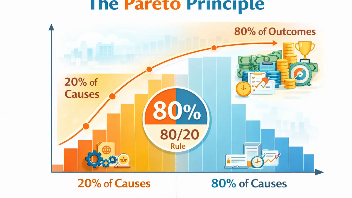
A Pareto chart is a specialized bar graph designed to highlight the most significant factors in a dataset by ranking them in descending order of impact. Each bar represents a category, such as defect types, customer complaints, or cost drivers, while a cumulative line overlays the bars to display the aggregated percentage contribution. The primary vertical axis measures absolute values such as frequency, cost, or duration, whereas the secondary axis expresses cumulative percentage from zero to one hundred. This dual-axis visualization allows decision-makers to quickly identify where the curve reaches a critical threshold, typically around seventy to eighty-five percent. By transforming raw data into a structured hierarchy, the chart simplifies prioritization and supports focused action planning.
Strategic Value of the Pareto Chart in Organizations
The strategic purpose of a Pareto analysis lies in resource optimization and impact maximization. Organizations rarely possess unlimited budgets, personnel, or time, making selective focus a necessity rather than a preference. By isolating the small number of categories that generate the majority of outcomes, leaders can allocate corrective measures where return on investment is highest. This logic aligns naturally with Lean management, continuous improvement, and Six Sigma methodologies, where waste reduction and defect minimization drive operational excellence. The clarity of the visual representation also enhances internal communication, enabling teams to align quickly around shared priorities. In complex systems, simplicity in visualization becomes a powerful decision-enabling mechanism.
Quality Management and Root Cause Prioritization
In quality management contexts, the Pareto chart identifies the defects or failure modes responsible for the majority of nonconformities. Rather than attempting to eliminate every minor anomaly, organizations focus on the few dominant issues that generate significant cost, rework, or customer dissatisfaction. For example, an analysis of 12,000 service tickets might reveal that four root causes explain 68 percent of recurring complaints, providing an immediate roadmap for corrective action. Concentrating on these critical drivers accelerates improvement cycles and reduces operational friction. When integrated with root cause analysis techniques, the chart strengthens evidence-based quality strategies. This targeted approach prevents dilution of effort and enhances measurable performance gains.
Commercial and Marketing Optimization
Sales and marketing teams leverage the 80/20 principle to identify high-value clients, profitable product lines, and efficient acquisition channels. A company may discover that 18 percent of its customers contribute 79 percent of gross margin, justifying enhanced retention and loyalty initiatives for that segment. Similarly, channel performance analysis often reveals that a minority of traffic sources drives most qualified leads. This prioritization informs budget allocation and campaign scaling decisions. By focusing investment on top-performing segments, organizations increase profitability without proportionally increasing cost. The Pareto chart thus becomes a financial optimization tool as much as an analytical device.
How to Build a Pareto Chart: A Complete Methodology
Constructing a reliable Pareto chart requires methodological discipline and data integrity. The process begins long before any visualization software is opened, as analytical clarity depends on defining the right question and collecting relevant data. Misaligned indicators or ambiguous categories can distort results and lead to misguided strategic decisions. Each stage of the method contributes to analytical validity and interpretative accuracy. When executed rigorously, the procedure transforms scattered data into structured insight. The following framework ensures that the resulting chart supports actionable conclusions rather than superficial observations.
Step 1: Define the Problem and Analytical Scope
Effective Pareto analysis starts with a clearly articulated problem statement that specifies the phenomenon under investigation. Whether examining project delays, defect frequency, customer churn, or cost overruns, clarity of purpose ensures coherent data collection. Defining the time frame and operational boundaries prevents inconsistent aggregation across incomparable datasets. Selecting the appropriate measurement unit, such as frequency, financial impact, or duration, directly influences interpretive relevance. A poorly defined scope generates misleading visualizations that obscure rather than clarify priorities. Precision at this stage safeguards analytical credibility throughout the process.
Step 2: Collect and Categorize Reliable Data
Data integrity forms the backbone of any meaningful Pareto analysis. Information should originate from validated reporting systems, structured databases, or documented operational logs rather than anecdotal estimation. Categories must be mutually exclusive and collectively exhaustive, ensuring that each data point fits into one defined segment without overlap. Excessively broad categories dilute insight, while overly granular classifications create fragmentation. In most operational contexts, between five and twelve categories provide a balanced level of clarity. Thoughtful categorization determines whether the chart reveals actionable insights or superficial patterns.
Step 3: Rank Data and Calculate Cumulative Percentages
After aggregating values per category, the next step involves sorting them in descending order of impact. Each category’s share of the total must be calculated as a percentage, followed by a cumulative percentage reflecting progressive contribution. This cumulative line allows observers to determine at what point the majority of impact is achieved. Spreadsheet software and business intelligence platforms automate these calculations, reducing risk of computational error. Accurate percentages ensure that strategic thresholds are identified precisely. Quantitative discipline underpins meaningful prioritization.
Step 4: Visualize and Identify the Strategic Threshold
The final visualization combines vertical bars representing categories with a superimposed cumulative curve plotted on a secondary axis. Decision-makers analyze the point at which the cumulative curve approaches a chosen threshold, often between seventy and eighty-five percent depending on strategic objectives. This threshold highlights the limited set of causes responsible for the dominant share of outcomes. However, interpretation must consider organizational context rather than applying the eighty percent benchmark mechanically. Strategic nuance ensures balanced decision-making. Visualization becomes valuable only when accompanied by thoughtful analysis.
Practical Applications Across Industries
The versatility of the Pareto chart explains its widespread adoption across sectors. Its analytical logic adapts to operational, financial, and strategic contexts without losing clarity. In healthcare, it can identify the most frequent causes of patient complaints or adverse events. In education, it may reveal the limited topics responsible for most student misunderstandings. In finance, it can expose the minority of risk factors driving majority exposure. Such adaptability makes the tool indispensable in performance-driven environments.
Project Management and Delay Reduction
Complex projects often suffer from recurring bottlenecks that compromise timelines and budgets. Pareto analysis can reveal that a small cluster of issues, such as approval delays or vendor dependencies, explains most schedule deviations. By addressing these dominant constraints, project managers increase predictability and stakeholder confidence. Concentrated intervention typically produces measurable acceleration in milestone completion. This approach supports proactive risk management. Focused remediation replaces reactive firefighting.
Supply Chain Optimization and ABC Classification
Inventory management frequently relies on ABC classification, a direct application of the Pareto principle. A limited subset of stock keeping units generally represents the majority of inventory value or revenue contribution. Class A items receive tighter control and monitoring, while B and C categories require progressively lighter oversight. This differentiated strategy optimizes working capital and minimizes stockouts of strategic goods. Pareto-based segmentation improves operational resilience. Strategic inventory control enhances profitability and stability.
Best Practices for Reliable Pareto Analysis
- Clarify the analytical objective before data collection to ensure relevance.
- Use consistent and comparable metrics across the selected timeframe.
- Avoid ambiguous catch-all categories that dilute interpretive value.
- Select the appropriate impact indicator based on strategic priorities.
- Complement the chart with root cause analysis for deeper insight.
Common Limitations and Analytical Pitfalls
While powerful, the Pareto chart does not establish causality and must not be interpreted as proof of direct cause-and-effect relationships. Categories may interact dynamically, meaning that isolating one factor without examining interdependencies could oversimplify reality. Selection bias in data collection can distort perceived priorities and misguide corrective actions. Overreliance on frequency without considering severity may lead to suboptimal decisions. Integrating the chart with complementary analytical tools strengthens reliability. Critical thinking remains essential when applying any heuristic framework.
Mini FAQ – Pareto Chart and 80/20 Principle
Does a Pareto chart always follow an 80/20 ratio?
No, the exact ratio varies depending on the dataset and context under examination. What matters is identifying a disproportionate concentration of impact rather than confirming a precise numerical split. A 75/25 or 85/15 distribution can still provide valuable prioritization insight. The principle emphasizes relative dominance, not mathematical symmetry. Flexibility in interpretation enhances strategic relevance.
How is the Pareto chart different from standard bar charts?
A standard bar chart displays categorical values without cumulative analysis or descending prioritization. The Pareto chart orders categories from highest to lowest impact and overlays a cumulative percentage curve. This additional dimension enables threshold identification and strategic focus. The combined visualization supports more effective decision-making. It transforms descriptive data into prioritization insight.
Why is the Pareto approach critical in 2026?
In 2026, organizations operate within complex digital ecosystems that generate massive data streams. Decision-makers must extract high-value insights rapidly without being overwhelmed by informational noise. The Pareto framework simplifies complexity by highlighting leverage points. It enhances resource efficiency and strategic clarity. Its continued relevance reflects its adaptability to modern data-driven environments.