Burndown Chart: Definition, Interpretation, Examples, and Agile Best Practices in 2026
The burndown chart is one of the most widely used visual tools in Agile project management, particularly within the Scrum framework. This chart tracks the evolution of the remaining work over time in order to evaluate whether a team is progressing toward completing a sprint, epic, or product release. By comparing the actual amount of work left to a projected ideal trajectory, teams gain immediate insight into delivery risk, scope changes, and sprint stability. In modern product development environments where predictability and transparency are critical, the burndown chart enables teams to quickly identify delays, blockers, or unrealistic estimations. Its simplicity makes it accessible to developers, product owners, stakeholders, and managers alike. In 2026, despite the emergence of more advanced analytics dashboards, the burndown chart remains a fundamental Agile artifact used daily by thousands of product teams to monitor sprint execution and maintain alignment between delivery expectations and actual progress.
What Is a Burndown Chart in Agile Project Management
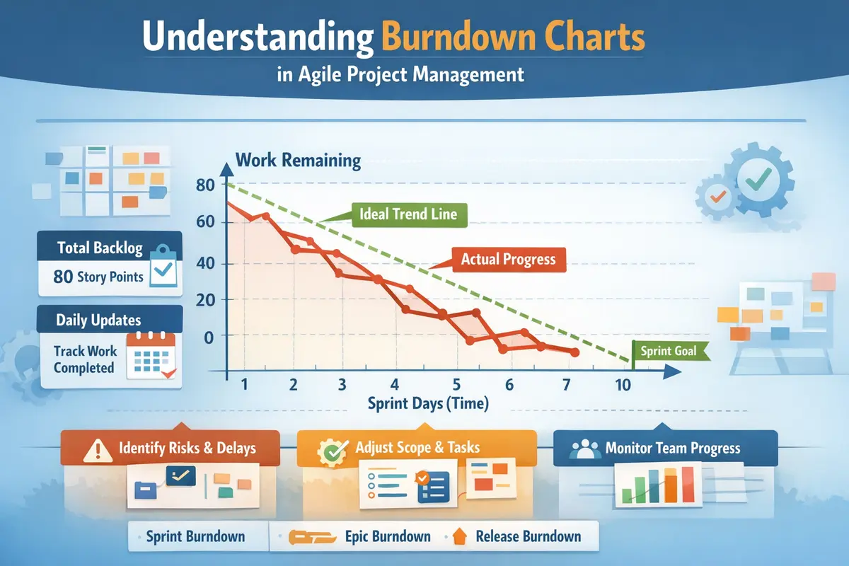
A burndown chart is a graphical representation that shows how much work remains in a project over a defined period of time. Typically used during a sprint, the horizontal axis represents time, while the vertical axis represents the total amount of work remaining. Work is usually measured using story points, hours, or backlog items depending on the team’s estimation method. As tasks are completed, the amount of remaining work decreases and the chart “burns down” toward zero. This visualization enables Agile teams to instantly see whether they are on track to finish the planned work within the sprint timeframe. Because the chart reflects real-time updates to the backlog, it serves as a transparent progress indicator for the entire team.
Core Components of a Burndown Chart
A burndown chart generally includes two essential lines that allow teams to evaluate progress against expectations. The first is the ideal line, which represents the theoretical rate at which work should be completed to finish the sprint exactly on time. This line is calculated by evenly distributing the total workload across the sprint duration. The second is the actual remaining work line, which reflects the real-time progress based on completed tasks. When these two lines stay relatively close together, it indicates that the team is progressing according to plan. When a gap emerges between them, the chart highlights potential risks such as delays, underestimated complexity, or scope changes introduced during the sprint.
Why Agile Teams Use Burndown Charts
The primary purpose of a burndown chart is to increase transparency and improve the predictability of Agile delivery cycles. Instead of analyzing dozens of individual tasks or tickets, teams can instantly visualize overall sprint progress through a single chart. This capability supports more effective communication during daily stand-ups and sprint reviews. According to industry analysis conducted in 2026, approximately 71% of Scrum teams rely on burndown or burnup charts as part of their sprint monitoring practices. This widespread adoption reflects the value of simple visual metrics that help teams detect delivery risks early and adjust their execution strategy before the sprint deadline approaches.
How to Read a Burndown Chart Correctly
Reading a burndown chart involves analyzing the relationship between the ideal trajectory and the actual progress line. When the actual line appears above the ideal line, it indicates that the team has more remaining work than expected at that point in the sprint, suggesting a potential delay. When the actual line drops below the ideal line, the team is ahead of schedule and progressing faster than anticipated. However, interpreting these signals requires context because several factors can influence the curve, including backlog adjustments, newly discovered bugs, or dependencies that temporarily block task completion. Understanding these patterns allows Agile teams to respond quickly to emerging issues and maintain control over sprint delivery.
Typical Patterns Found in Burndown Charts
The shape of the actual progress curve can reveal a great deal about what is happening inside a sprint. A steady, smooth decline that mirrors the ideal line usually indicates balanced workload distribution and accurate estimations. A horizontal plateau often signals a technical blocker or a set of tasks that cannot be completed until a dependency is resolved. In some situations, the curve may even rise upward temporarily, reflecting new work added to the sprint backlog after planning. These fluctuations provide valuable insights that help teams improve their planning accuracy and adapt their sprint strategy to changing circumstances.
Common Misinterpretations
A frequent mistake is treating the burndown chart as a direct measure of productivity or individual performance. The chart only tracks the amount of work remaining and does not reflect task complexity, code quality, or collaboration challenges. For instance, a sharp drop in the curve may simply indicate that several small tasks were completed simultaneously rather than a significant productivity improvement. Similarly, a slow decline might correspond to a complex technical feature that requires several days of development before completion. Because of these limitations, Agile teams should analyze burndown charts alongside other metrics such as velocity, lead time, and cycle time to obtain a more comprehensive understanding of project performance.
How to Create a Burndown Chart Step by Step
Creating a burndown chart follows a structured process that aligns naturally with the Scrum workflow. The first step involves defining the sprint backlog, which includes all tasks or user stories the team commits to delivering during the sprint. Each backlog item must then be estimated using story points or hours to determine the total workload. Once the workload is calculated, the ideal trajectory can be plotted by distributing the work evenly across the sprint timeline. As tasks are completed throughout the sprint, the remaining work value is updated daily, allowing the chart to reflect the real progress of the project. This continuous update cycle transforms the burndown chart into a live indicator of sprint health.
Practical Steps for Building a Burndown Chart
Constructing a reliable burndown chart requires careful attention to estimation accuracy and backlog clarity. When estimations are inconsistent or tasks are poorly defined, the resulting chart may provide misleading signals about project progress. Agile teams therefore follow a consistent workflow when generating burndown charts to ensure the data accurately reflects sprint activity. The following steps represent a common approach used by modern product teams regardless of the project management software they rely on.
- Define the sprint duration and target delivery date
- Estimate each backlog item using story points or hours
- Calculate the total amount of work included in the sprint
- Create the ideal progress line based on the sprint length
- Update the remaining work value every day
- Compare the real progress line with the ideal trajectory
By following this structure, teams obtain a clear visualization of sprint progress and can quickly detect deviations from the original plan. This visualization becomes particularly valuable during daily stand-up meetings where team members discuss blockers and coordinate their next actions.
Types of Burndown Charts Used in Agile Projects
The concept of a burndown chart can be applied at different levels of Agile planning, which explains why several variations of the chart exist. While the sprint burndown is the most widely recognized format, teams often create additional burndown charts to track larger development initiatives or product releases. Each variation serves a specific purpose in Agile planning and helps stakeholders understand progress from different perspectives. Selecting the appropriate chart depends on whether the team wants to monitor short-term sprint execution or long-term product development milestones.
Sprint Burndown Chart
The sprint burndown chart tracks the remaining work within a single sprint and is updated daily as tasks are completed. Because most Scrum sprints last one to two weeks, this chart offers a detailed view of short-term progress. For example, if a sprint begins with 80 story points of work distributed across ten working days, the ideal line will decrease steadily from 80 to zero during that period. When the real progress curve stays above this line, the team may need to adjust priorities or reduce scope in order to meet the sprint goal. This chart therefore plays a crucial role in daily sprint monitoring and helps teams maintain alignment with their commitments.
Epic Burndown Chart
An epic burndown chart tracks progress across a larger group of related user stories grouped under a single epic. Unlike the sprint burndown chart, this version spans multiple sprints and provides a broader perspective on product development. It helps product owners and stakeholders understand how quickly major features are progressing toward completion. In some Agile tools, epic burndown charts also highlight scope changes by distinguishing between completed work, remaining work, and newly added backlog items. This additional context makes it easier to assess whether feature development remains aligned with the overall product roadmap.
Release Burndown Chart
A release burndown chart aggregates sprint data to show progress toward delivering an entire product release. It typically spans several months and includes all the work required to launch a new version of a software product. Product managers and executives often rely on this chart to monitor strategic milestones and communicate delivery expectations to stakeholders. By visualizing progress across multiple sprints, the release burndown chart helps organizations anticipate delays and adjust development priorities accordingly.
Burndown Chart vs Burnup Chart
The burnup chart is another Agile visualization technique that tracks completed work rather than remaining work. While the burndown chart focuses on how much effort remains before reaching zero, the burnup chart shows how much work has been completed relative to the total scope. This approach makes scope changes more visible because the total amount of work is represented as a separate line. When the project scope increases, the total scope line rises while the completed work line continues progressing upward.
In environments where the backlog changes frequently, many teams prefer burnup charts because they provide clearer visibility into scope evolution. However, when the sprint scope is relatively stable, the burndown chart remains the simplest and fastest method to evaluate sprint progress. Its straightforward visual structure allows teams to detect delays instantly without analyzing multiple indicators simultaneously.
Limitations of the Burndown Chart
Despite its usefulness, the burndown chart has several limitations that Agile teams must consider when interpreting its results. The chart measures only the quantity of work remaining and does not capture qualitative aspects of development such as code maintainability, technical debt, or testing coverage. A rapid decline in remaining work could mask underlying quality issues, while a slow decline may simply reflect a complex feature requiring significant development effort. Because of these limitations, relying solely on the burndown chart to evaluate project performance can lead to misleading conclusions.
Common Anti-Patterns
Misusing the burndown chart can reduce its effectiveness and create confusion within Agile teams. These anti-patterns often appear when organizations attempt to transform Agile metrics into rigid performance indicators rather than collaborative planning tools. Recognizing these pitfalls helps teams maintain the integrity of their Agile monitoring practices.
- Using the chart to evaluate individual developer productivity
- Ignoring scope changes that occur during the sprint
- Measuring task count instead of actual effort
- Closing tasks late at the end of the sprint
- Changing story point estimates mid-sprint
When these issues occur, the burndown chart no longer reflects the real state of the project and loses its ability to guide decision-making. Mature Agile teams therefore treat the burndown chart primarily as a transparency tool that supports discussion and continuous improvement rather than as a strict performance metric.
SEO-Optimized FAQ About Burndown Charts
What is the purpose of a burndown chart in Scrum
The burndown chart is designed to visualize the amount of work remaining in a sprint so that teams can evaluate whether they are likely to meet their sprint goal. By displaying the relationship between planned progress and actual progress, the chart highlights delivery risks and allows teams to adjust their strategy before the sprint ends. It also simplifies communication with stakeholders by presenting sprint progress in an intuitive visual format that requires minimal explanation.
What is the difference between velocity and a burndown chart
Velocity measures the average amount of work a team completes during a sprint, typically expressed in story points. The burndown chart, on the other hand, visualizes how the remaining work evolves during a specific sprint. Velocity helps teams estimate how much work they can plan for future sprints, while the burndown chart tracks whether the current sprint is progressing according to plan. Together, these two metrics improve forecasting accuracy and strengthen Agile planning.
Why does a burndown chart sometimes move upward
A burndown chart may temporarily rise when new work is added to the sprint backlog after the sprint has already started. This situation often occurs when teams discover critical bugs, technical dependencies, or urgent feature requests during development. Because the chart tracks the total amount of remaining work, any increase in scope results in an upward movement of the curve. This behavior helps teams visualize how scope changes impact sprint progress and delivery timelines.